

The Shift Toward Mobile-First Casino Design | Shikaka
Introduction
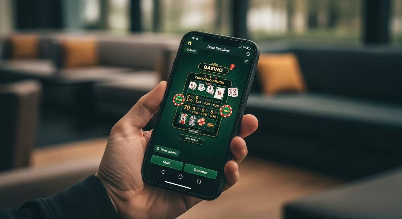
Below is a side-by-side breakdown of the shift toward mobile-first casino design at Shikaka. A decade ago, desktop browsers were the default entry point for online play; today, most sessions start and end on a phone screen.
That reversal has forced operators to rethink layout, load times, and navigation from the ground up rather than simply shrinking a desktop site. Players at Shikaka casino now expect the same depth of game selection and account tools on a five-inch screen that they once found on a monitor.
This article compares the old desktop-first approach with the current mobile-first standard, and shares the casino insights needed to judge whether a platform has genuinely adapted or just added a responsive skin. We will look at what separates a well-built mobile experience from a rushed one, and why the distinction matters for anyone choosing where to play.
What to Look For
Not every site labelled “mobile-friendly” delivers the same experience. Some simply compress a desktop layout, while others rebuild navigation, checkout, and game loading specifically for touchscreens.
| Pros | Cons |
|---|---|
| Faster load times on cellular data through compressed assets | Smaller screens can crowd paytables and terms into tiny text |
| Touch-optimised buttons reduce mis-taps during play | Some game libraries load slower than the full-size desktop client |
| One-handed navigation menus simplify account access | Battery drain increases with graphics-heavy slot titles |
When comparing platforms, check whether the mobile site loads game previews before you tap in, and whether deposit and withdrawal forms fit the screen without horizontal scrolling. These small details separate a native-feeling build from a stretched desktop layout.
- Load speed — pages should render in under three seconds on average mobile connections.
- Thumb-zone layout — primary buttons sit within easy reach of one hand.
- Readable typography — text scales without needing a pinch-to-zoom gesture.
- Consistent account sync — balances and history match across devices instantly.
Why You Should Care
Mobile-first design is not a cosmetic preference; it shapes how quickly you can find a game, verify your identity, or cash out. A clunky mobile flow can add real friction to something that should take seconds.
Session length and satisfaction both track closely with interface quality. If menus lag or buttons are too small to tap accurately, players tend to disengage faster, regardless of how strong the game catalogue is underneath.
- Time efficiency — a streamlined mobile menu gets you from login to gameplay in fewer taps.
- Security clarity — well-designed mobile verification screens make two-factor prompts easier to complete correctly.
- Lower error rates — larger touch targets reduce accidental bets or wrong-field entries during checkout.
These casino insights matter most during high-traffic moments, such as a popular slot launch, when a slow or cluttered interface can mean missing a promotion window entirely.
Common Misconceptions
A common assumption is that any site viewable on a phone counts as mobile-first. In reality, mobile-first means the interface was designed for small screens from the start, then scaled up for desktop, not the reverse.
- “Responsive equals mobile-first” — a responsive layout can still bury key features behind extra menus not present on the true mobile build.
- “More animations mean better design” — heavy motion effects often slow load times on mid-range phones.
- “App-only means mobile-first” — some browser-based sites outperform dedicated apps because they skip installation and update delays.
- “All game libraries perform the same” — individual titles are often optimised separately, so performance can vary game to game.
Recognising these misconceptions helps you judge a platform by its actual usability rather than by marketing language describing it as “mobile-ready.”
Strategies to Avoid
Some habits make the mobile experience worse regardless of how well a site is built. Avoiding a few common patterns keeps sessions smoother and less error-prone.
- Ignoring app or browser updates — outdated versions often miss the latest interface fixes and load slower.
- Playing on unstable connections — a dropped signal mid-transaction can cause confusing balance delays.
- Skipping account verification early — leaving identity checks for withdrawal day adds unnecessary friction on a small screen.
- Overloading background apps — too many open tabs or apps can slow graphics-heavy game rendering.
None of these are dramatic mistakes, but together they explain most of the frustration players report with otherwise solid mobile platforms.
Step-by-Step Guide
Evaluating a mobile-first casino platform is straightforward once you know what to test. Use the sequence below the next time you try a new site or app.
- Open the site on mobile data, not Wi-Fi, and time how long the homepage takes to load.
- Browse the game library and check whether thumbnails and search filters render cleanly on the first screen.
- Start the account verification process to see whether document upload works smoothly from a phone camera.
- Test a small deposit and confirm the checkout form fits the screen without zooming.
- Compare the mobile navigation menu against the desktop version for missing features.
Running through these steps at Shikaka or any comparable platform gives a clearer picture than reading marketing copy alone. For further reading on related topics, see bonuses available to new players.
Ultimately, mobile-first design is about removing friction between intention and action. The platforms that treat the phone as the primary device, not an afterthought, tend to deliver the most consistent experience over time.